Neutral Colors: Creating Harmony and Sophistication
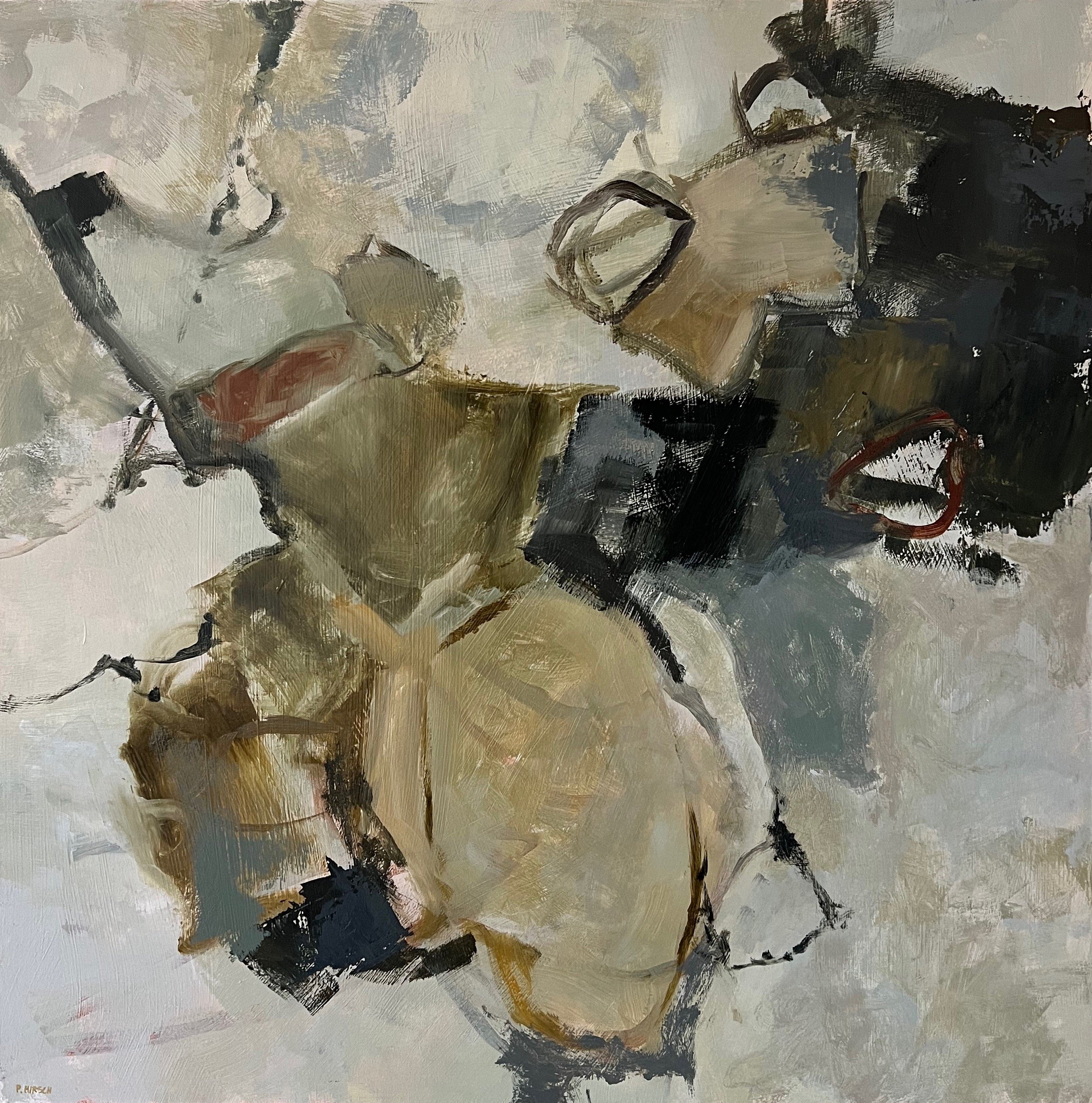
©Pamela Hirsch, Weekend in Cognito, Acrylic, 24 x 24 inches
Neutral colors often don’t get the recognition they deserve. Traditionally, neutrals include shades like white, black, grey, brown, cream, beige, and ivory. These colors, which can range from light to dark values, are often seen as the “universal donors” of the color world. They’re versatile and pair effortlessly with vibrant hues. But not all neutrals are created equal. Some are warm, others cool, and a few lie in the true neutral zone. While they might technically pair with everything, some neutrals work better in certain contexts than others.
One of the best things about neutrals is that they give your eyes a place to rest. Think of a large, fluffy cloud—it’s peaceful and calming and you could go on looking at it for awhile. In a world as fast-paced, turbulent and unsettling as ours, this sense of calm is something we could all use more of, whether in our surroundings or in art.
The Bad Rap of Neutrals
Neutrals sometimes get criticized for being boring. And yes, a room or painting dominated entirely by neutrals can feel dull. But on the flip side, if everything is full of bold, bright colors, it can feel chaotic and overwhelming. Balance is everything.
Think about the vibrant, intricate designs of traditional gypsy wagons. They’re mesmerizing and full of wonder, but all that energy can feel like too much after a while. Add some neutrals to the mix—say, a 2:1 ratio of neutrals to vibrant colors—and suddenly, the space becomes more livable. If you’re not a gypsy, that is!
“Sad Beige” and the Criticism of Neutral Trends
A viral video parodying “sad beige” decor (and children) poked fun at the trend of neutral-toned homes, children’s rooms, and even clothing. Hayley DeRoche, the creator of the video, described “sad beige” as “anything neutral-toned that has had joy siphoned out of it.” While the video is really funny, it misses the point that neutrals, when used thoughtfully, can bring a lot of value to a space or artwork.
Enter Pantone’s 2025 Color of the Year: Mocha Mousse
Pantone’s 2025 Color of the Year, Mocha Mousse, is a soft, warm brown that’s all about warmth, calm, and a sense of luxurious well-being. Some critics have dismissed it as outdated or even compared it with the “poop” emoji. But honestly? Mocha Mousse is a beautiful color that embodies the grounding, restorative qualities neutrals are all about. Pantone’s choice reminds us how important neutrals are for creating balanced and inviting spaces.
Why Neutrals Matter in Art and Design
Neutrals are essential for balance, whether in decor or paintings. They add nuance and let vibrant colours pop. Imagine if everything were bright and wonderful all the time; it would get old fast, at least it would for me. Neutrals are like the “downtime” that makes moments of brilliance stand out.
And let’s not forget, neutrals are inherently sophisticated. If you’re going for a grown-up, elegant look in your home, neutrals are a must.
In paintings especially, color behaves differently based on the color placed next to it. I can mix up a color that I think is a very subdued blue-grey on my palette, but when I brush it on my canvas, it can become almost jewel-like depending on what’s next to it. The brighter colors would not be as amazing without neutrals.
Mixing Your Own Neutrals
If you’re an artist, creating your own neutrals can make your work even more dynamic. Here’s how:
White + Black: Mixing white with black gives you a range of greys, from light to dark. These can feel a little flat, but they’re a good starting point.
Complementary Colors: Mixing complementary colors creates more interesting neutrals. For example:
Red + Green = Warm neutral
Orange + Blue = Cool neutral
Yellow + Purple = Soft brown or beige
Try different versions for each of the hues. For example, combine quinacridone red and viridian for one mixture and perhaps cadmium red light and sap green for another. Add white or black to these mixtures to adjust the value and find the perfect shade for your work.
Embracing Neutrals
Far from being boring, neutrals are the backbone of great design and art. They bring balance, sophistication, and calm. Stop overlooking them and instead celebrate the nuance and elegance they can add to our spaces and creations.